Project Custom CSS Updated 20/10/26
Works with the JavaScript to customise the PX Help Centre with Dark mode, topic printing, footer information and improved screen and print formatting.
This file contains the custom CSS styling for the PX Help Centre. In short, it:
- Styles the version, copyright and update information in the footer. Pasted text
- Adds styling for a Dark mode switch in the top-right header. Pasted text
- Adds and styles a Print topic button. Pasted text
- Provides the complete dark-mode appearance for topic text, headings, links, navigation, tables, code, forms and page backgrounds. Pasted text
- Preserves text that has been deliberately given a specific colour when Dark mode is used. Pasted text
- Forces pages to print using a white background and black text, even if Dark mode is active, and hides the Dark mode and Print controls from the printed page.
- Prints page numbers.
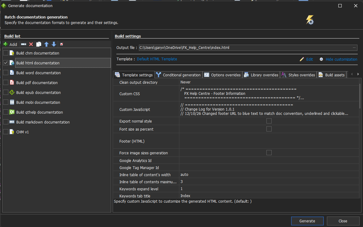
Click on Home > Generate help > Build html documentation menu icons, then copy and paste the following CSS code into the appropriate location called Custom CSS field. Refer to the screenshot below for an example:
// =======================================
// Change Log for Version 1.0.1
//
// 07/10/26 - Initial release
// 20/10/26 - Added print page numbers feature
//
//========================================
/* ========================================
PX Help Centre - Footer Information
======================================== */
.version-info {
display: block;
margin-top: 1em;
font-size: 1em;
font-family: Aptos, sans-serif;
color: #555;
text-align: left;
margin-right: 2em;
max-width: fit-content;
}
.copyright {
display: block;
margin-top: 0.25em;
font-size: 1em;
font-family: Aptos, sans-serif;
color: #555;
text-align: left;
margin-right: 2em;
max-width: fit-content;
}
.update-notice {
display: block;
margin-top: 0.25em;
font-size: 1em;
font-family: Aptos, sans-serif;
color: #555;
text-align: left;
margin-right: 2em;
max-width: fit-content;
}
/* ========================================
PX Help Centre Logo / Dark Mode Control
======================================== */
/*
Places the Dark mode control immediately
to the left of the HelpNDoc logo.
*/
#px-header-right {
position: absolute;
right: 16px;
top: 50%;
transform: translateY(-50%);
display: flex;
align-items: center;
gap: 39px;
z-index: 1000;
}
/* Keep the existing HelpNDoc logo at its normal size. */
#px-header-right img.logo {
position: static !important;
float: none !important;
margin: 0 !important;
transition: opacity 0.2s ease;
}
/* Complete Dark mode control */
#px-dark-mode-control {
display: flex;
align-items: center;
gap: 9px;
white-space: nowrap;
font-family: "Segoe UI", Aptos, sans-serif;
font-size: 14px;
font-weight: 400;
color: inherit;
}
/* Dark mode text */
#px-dark-mode-control .px-theme-label {
line-height: 1;
user-select: none;
}
/* Windows 11-style switch */
#px-dark-mode-control .px-switch {
position: relative;
display: inline-block;
width: 40px;
height: 20px;
margin: 0;
flex: 0 0 auto;
}
/* Hide native checkbox but keep it accessible */
#px-dark-mode {
position: absolute;
width: 1px;
height: 1px;
margin: -1px;
padding: 0;
overflow: hidden;
clip: rect(0 0 0 0);
clip-path: inset(50%);
white-space: nowrap;
border: 0;
}
/* Switch track */
#px-dark-mode-control .px-switch-slider {
position: absolute;
inset: 0;
cursor: pointer;
background-color: #8a8a8a;
border: 1px solid #6f6f6f;
border-radius: 999px;
transition:
background-color 0.15s ease,
border-color 0.15s ease;
}
/* Switch thumb */
#px-dark-mode-control .px-switch-slider::before {
content: "";
position: absolute;
width: 14px;
height: 14px;
left: 2px;
top: 2px;
background-color: #ffffff;
border-radius: 50%;
transition: transform 0.15s ease;
}
/* Dark mode ON */
#px-dark-mode:checked + .px-switch-slider {
background-color: #3aaee8;
border-color: #3aaee8;
}
#px-dark-mode:checked + .px-switch-slider::before {
transform: translateX(20px);
}
/* Keyboard focus */
#px-dark-mode:focus-visible + .px-switch-slider {
outline: 2px solid #60cdff;
outline-offset: 2px;
}
/* Subtle hover effect */
#px-dark-mode-control .px-switch:hover .px-switch-slider {
filter: brightness(1.06);
}
/* Keep label readable in dark mode */
html.dark-mode #px-dark-mode-control {
color: #ffffff;
}
/* Keep the control compact on smaller screens */
@media screen and (max-width: 768px) {
#px-header-right {
right: 10px;
gap: 8px;
}
#px-dark-mode-control {
gap: 6px;
font-size: 13px;
}
}
/* ========================================
PX Help Centre - Print Topic Control
======================================== */
/*
Print control sits immediately before the
Dark mode control in the right-hand header group.
*/
#px-print-button {
display: inline-flex;
align-items: center;
justify-content: center;
gap: 7px;
height: 30px;
margin: 0;
padding: 0 4px;
background-color: transparent;
color: inherit;
border: 1px solid transparent;
border-radius: 4px;
font-family: "Segoe UI", Aptos, sans-serif;
font-size: 14px;
font-weight: 400;
line-height: 1;
white-space: nowrap;
cursor: pointer;
transition:
background-color 0.15s ease,
border-color 0.15s ease;
}
/* "Print topic" text */
#px-print-button .px-print-label {
line-height: 1;
user-select: none;
}
/* Slightly larger printer icon */
#px-print-button .bi {
display: block;
font-size: 21px;
line-height: 1;
}
/* Windows 11-style hover */
#px-print-button:hover {
background-color: rgba(127, 127, 127, 0.16);
border-color: rgba(127, 127, 127, 0.20);
}
/* Keyboard focus */
#px-print-button:focus-visible {
outline: 2px solid #60cdff;
outline-offset: 2px;
}
/* Keep text readable in dark mode */
html.dark-mode #px-print-button {
color: #ffffff;
}
/*
Print controls should not appear on paper.
*/
@media print {
/* Match the colour of both footer lines when printing,
including nested text and when dark mode is enabled. */
.version-info,
.copyright,
.version-info *,
.copyright *,
html.dark-mode .version-info,
html.dark-mode .copyright,
html.dark-mode .version-info *,
html.dark-mode .copyright * {
color: #555555 !important;
-webkit-text-fill-color: #555555 !important;
}
#px-print-button,
#px-dark-mode-control {
display: none !important;
}
}
/* ========================================
Dark Mode - Whole Page
======================================== */
html.dark-mode {
color-scheme: dark;
background-color: #1e1e1e !important;
}
html.dark-mode body {
background-color: #1e1e1e !important;
color: #e6e6e6 !important;
min-height: 100vh;
}
/* ========================================
Entire Right-hand Area
======================================== */
html.dark-mode #main {
background-color: #1e1e1e !important;
color: #e6e6e6 !important;
min-height: 100vh;
}
html.dark-mode article {
background-color: #1e1e1e !important;
color: #e6e6e6 !important;
}
/*
HelpNDoc places an additional footer
after the topic article.
*/
html.dark-mode #main > footer,
html.dark-mode footer {
background-color: #1e1e1e !important;
color: #e6e6e6 !important;
}
/* ========================================
Dark Mode - Default Topic Text
======================================== */
/*
Normal HelpNDoc text is treated as black/default text.
Therefore it becomes white in dark mode.
Only elements explicitly marked by JavaScript as genuinely
coloured are allowed to override this.
*/
html.dark-mode #topic-content .main-content,
html.dark-mode #topic-content .main-content p,
html.dark-mode #topic-content .main-content div,
html.dark-mode #topic-content .main-content span,
html.dark-mode #topic-content .main-content li,
html.dark-mode #topic-content .main-content b,
html.dark-mode #topic-content .main-content strong,
html.dark-mode #topic-content .main-content em,
html.dark-mode #topic-content .main-content i,
html.dark-mode #topic-content .main-content u,
html.dark-mode #topic-content .main-content font,
html.dark-mode #topic-content .main-content [class^="rvts"],
html.dark-mode #topic-content .main-content [class*=" rvts"] {
color: #ffffff !important;
}
/*
Remove HelpNDoc light/white inline backgrounds in dark mode.
*/
html.dark-mode #topic-content .main-content span,
html.dark-mode #topic-content .main-content a,
html.dark-mode #topic-content .main-content [class^="rvts"],
html.dark-mode #topic-content .main-content [class*=" rvts"] {
background: transparent !important;
background-color: transparent !important;
background-image: none !important;
}
/*
Genuinely coloured text keeps its original light-mode colour.
*/
html.dark-mode #topic-content .main-content .px-preserve-colour {
color: var(--px-original-colour) !important;
background: transparent !important;
background-color: transparent !important;
background-image: none !important;
}
/*
Nested spans inherit the preserved colour from the marked
parent and never keep a white background.
*/
html.dark-mode #topic-content .main-content .px-preserve-colour span,
html.dark-mode #topic-content .main-content a.px-preserve-colour span {
color: inherit !important;
background: transparent !important;
background-color: transparent !important;
background-image: none !important;
}
/* ========================================
Main Topic Content
======================================== */
html.dark-mode #topic-content,
html.dark-mode .main-content {
background-color: #1e1e1e !important;
color: #ffffff !important;
}
/* Paragraphs */
html.dark-mode #topic-content p:not(.px-preserve-colour) {
background-color: transparent !important;
color: #ffffff !important;
}
/* HelpNDoc generated spans */
html.dark-mode #topic-content span:not(.px-preserve-colour) {
background-color: transparent !important;
color: #ffffff !important;
}
/* List items with no authored colour are treated as normal black text */
html.dark-mode #topic-content li:not(.px-preserve-colour) {
background-color: transparent !important;
color: #ffffff !important;
}
/* HelpNDoc generated rvts text */
html.dark-mode #topic-content [class^="rvts"]:not(.px-preserve-colour),
html.dark-mode #topic-content [class*=" rvts"]:not(.px-preserve-colour) {
background-color: transparent !important;
color: #ffffff !important;
}
/* ========================================
Headings
======================================== */
html.dark-mode #topic-content h1:not(.px-preserve-colour),
html.dark-mode #topic-content h2:not(.px-preserve-colour),
html.dark-mode #topic-content h3:not(.px-preserve-colour),
html.dark-mode #topic-content h4:not(.px-preserve-colour),
html.dark-mode #topic-content h5:not(.px-preserve-colour),
html.dark-mode #topic-content h6:not(.px-preserve-colour) {
background-color: transparent !important;
color: #ffffff !important;
}
/* ========================================
Topic Links
======================================== */
/* Normal links */
html.dark-mode #topic-content .main-content a:not(.px-preserve-colour) {
color: #8ab4f8 !important;
background: transparent !important;
background-color: transparent !important;
}
html.dark-mode #topic-content .main-content a:not(.px-preserve-colour):hover {
color: #aecbfa !important;
}
/* Explicitly coloured links */
html.dark-mode #topic-content .main-content a.px-preserve-colour,
html.dark-mode #topic-content .main-content a.px-preserve-colour:hover {
color: var(--px-original-colour) !important;
background: transparent !important;
background-color: transparent !important;
}
/* ========================================
Breadcrumb / Topic Navigation
======================================== */
html.dark-mode #topic-content .navigation,
html.dark-mode #topic-content .breadcrumb {
background-color: #1e1e1e !important;
color: #cccccc !important;
}
html.dark-mode #topic-content .breadcrumb li {
color: #cccccc !important;
}
html.dark-mode #topic-content .breadcrumb a {
color: #8ab4f8 !important;
}
/* ========================================
Previous / Next / Up Buttons
======================================== */
html.dark-mode #topic-content .nav-arrows .btn {
background-color: #303134 !important;
color: #ffffff !important;
border-color: #555555 !important;
}
html.dark-mode #topic-content .nav-arrows .btn:hover {
background-color: #444444 !important;
color: #ffffff !important;
}
/* ========================================
Topic Footer
======================================== */
html.dark-mode #topic_footer,
html.dark-mode #topic_footer_content {
background-color: #1e1e1e !important;
color: #bcbcbc !important;
}
html.dark-mode .version-info,
html.dark-mode .copyright,
html.dark-mode .update-notice {
background-color: transparent !important;
color: #bcbcbc !important;
}
/* ========================================
Tables
======================================== */
html.dark-mode #topic-content table {
background-color: #252525 !important;
color: #e6e6e6 !important;
}
html.dark-mode #topic-content tbody,
html.dark-mode #topic-content tr {
background-color: #252525 !important;
color: #ffffff !important;
}
html.dark-mode #topic-content td:not(.px-preserve-colour) {
background-color: #252525 !important;
color: #ffffff !important;
border-color: #555555 !important;
}
html.dark-mode #topic-content th:not(.px-preserve-colour) {
background-color: #333333 !important;
color: #ffffff !important;
border-color: #555555 !important;
}
/* ========================================
Code / Preformatted Text
======================================== */
html.dark-mode #topic-content pre,
html.dark-mode #topic-content code {
background-color: #292929 !important;
color: #eeeeee !important;
}
/* ========================================
Horizontal Rules
======================================== */
html.dark-mode #topic-content hr {
border-color: #555555 !important;
opacity: 1;
}
/* ========================================
Form Controls Inside Topics
======================================== */
html.dark-mode #topic-content input,
html.dark-mode #topic-content select,
html.dark-mode #topic-content textarea {
background-color: #292929 !important;
color: #ffffff !important;
border-color: #555555 !important;
}
/* ========================================
Images
======================================== */
/*
Do not alter photographs, screenshots
or diagrams when switching theme.
*/
html.dark-mode #topic-content img {
opacity: 1;
}
/* ========================================
Remaining Page Areas
======================================== */
html.dark-mode .mask {
background-color: #1e1e1e;
}
/* ========================================
Printing - Always Use Light Appearance
======================================== */
@media print {
html,
html.dark-mode,
body,
html.dark-mode body,
#main,
html.dark-mode #main,
article,
html.dark-mode article,
#topic-content,
html.dark-mode #topic-content,
.main-content,
html.dark-mode .main-content,
#topic_footer,
html.dark-mode #topic_footer,
#topic_footer_content,
html.dark-mode #topic_footer_content,
footer,
html.dark-mode footer {
background: #ffffff !important;
background-color: #ffffff !important;
color: #000000 !important;
color-scheme: light !important;
}
html.dark-mode #topic-content p:not(.px-preserve-colour),
html.dark-mode #topic-content span:not(.px-preserve-colour),
html.dark-mode #topic-content li:not(.px-preserve-colour),
html.dark-mode #topic-content td:not(.px-preserve-colour),
html.dark-mode #topic-content th:not(.px-preserve-colour),
html.dark-mode #topic-content [class^="rvts"]:not(.px-preserve-colour),
html.dark-mode #topic-content [class*=" rvts"]:not(.px-preserve-colour) {
color: #000000 !important;
background: transparent !important;
background-color: transparent !important;
}
html.dark-mode #topic-content .px-preserve-colour,
html.dark-mode #topic-content a.px-preserve-colour,
html.dark-mode #topic-content a.px-preserve-colour:hover {
color: var(--px-original-colour) !important;
background: transparent !important;
background-color: transparent !important;
}
html.dark-mode #topic-content h1:not(.px-preserve-colour),
html.dark-mode #topic-content h2:not(.px-preserve-colour),
html.dark-mode #topic-content h3:not(.px-preserve-colour),
html.dark-mode #topic-content h4:not(.px-preserve-colour),
html.dark-mode #topic-content h5:not(.px-preserve-colour),
html.dark-mode #topic-content h6:not(.px-preserve-colour) {
color: #000000 !important;
background: transparent !important;
}
/* Give the version and copyright sections identical print typography. */
.version-info,
.copyright {
font-family: Aptos, sans-serif !important;
font-size: 1em !important;
font-weight: 400 !important;
font-style: normal !important;
}
/* Ensure nested text cannot override the matching footer font. */
.version-info *,
.copyright * {
font-family: inherit !important;
font-size: inherit !important;
font-weight: inherit !important;
font-style: inherit !important;
}
/* Match the colour of both footer lines when printing,
including nested text and when dark mode is enabled. */
.version-info,
.copyright,
.version-info *,
.copyright *,
html.dark-mode .version-info,
html.dark-mode .copyright,
html.dark-mode .version-info *,
html.dark-mode .copyright * {
color: #555555 !important;
-webkit-text-fill-color: #555555 !important;
}
#px-print-button,
#px-dark-mode-control {
display: none !important;
}
}
/* ========================================
Printing - Automatic Page Numbers
======================================== */
@page {
/* Reserve space at the bottom of each printed page. */
margin-bottom: 18mm;
@bottom-center {
content: "Page " counter(page) " of " counter(pages);
font-family: "Segoe UI", Aptos, sans-serif;
font-size: 9pt;
color: #000000;
}
}
/* ========================================
On-screen Footer - Matching Typography
======================================== */
/* Make both footer lines identical in light mode. */
@media screen {
.version-info,
.copyright,
.version-info *,
.copyright * {
font-family: Aptos, sans-serif !important;
font-size: 1em !important;
font-weight: 400 !important;
font-style: normal !important;
color: #555555 !important;
-webkit-text-fill-color: #555555 !important;
}
/* Keep both lines identical in dark mode. */
html.dark-mode .version-info,
html.dark-mode .copyright,
html.dark-mode .version-info *,
html.dark-mode .copyright * {
color: #bcbcbc !important;
-webkit-text-fill-color: #bcbcbc !important;
}
}
/* ========================================
Dark Mode - Update Notice On Screen
======================================== */
@media screen {
/* Match the subdued footer text without changing its link colour. */
html.dark-mode .update-notice,
html.dark-mode .update-notice *:not(a) {
font-family: Aptos, sans-serif !important;
font-size: 1em !important;
font-weight: 400 !important;
font-style: normal !important;
color: #bcbcbc !important;
-webkit-text-fill-color: #bcbcbc !important;
}
/* Keep the Help Centre URL blue and underlined. */
html.dark-mode .update-notice a,
html.dark-mode .update-notice a * {
font-family: Aptos, sans-serif !important;
font-size: 1em !important;
font-weight: 400 !important;
font-style: normal !important;
color: #71b6fb !important;
-webkit-text-fill-color: #71b6fb !important;
text-decoration: underline !important;
}
}